Bhuku Case Study
DesignLab Capstone Project
Bhuku transforms book organization into an effortless adventure for avid readers. Drawing from Goodreads' limitations, I spearheaded the UX/UI design, embedding OCR scanning for quick adds and gamified trackers to spark daily engagement. From deep dives into user habits to polished prototypes, I built a lively app that turns chaotic collections into curated joys.
The Challenge
Bhuku sought to eclipse apps like Goodreads by prioritizing delight in book management. The vision: an app that automates entry with OCR camera scans, sends tailored notifications to sustain interest, and gamifies reading progress—all while keeping things simple and fun for everyday users.
The Solution
I envisioned Bhuku as a reader's trusty companion—practical yet playful. Starting with market trends and reader conversations, I pinpointed needs for personalization and ease. Building personas and mapping journeys guided the framework, leading to layered wireframes in Sketch and InVision. Feedback loops from testing sharpened the edges, resulting in a nimble app where organizing books feels like a rewarding ritual.
Personas make it real.
Empathy makes it possible.
To infuse Bhuku with true resonance, I did 1-1 interviews, market research, and rival app breakdowns to expose real hurdles. Overcrowded layouts in Goodreads bombarded users with ads, while Libib's vague suggestions left readers uninspired—as Erin shared. Andy highlighted the drudgery of manual inputs, and LibraryThing's cramped buttons posed access barriers, compounded by scattered search tools and vague intros.
These hurdles inspired Bhuku's core: a tidy layout, effortless OCR imports, custom alerts, and progress badges. With straightforward paths, inclusive touches, refined search filters, and welcoming guides, the app evolved into a haven for seamless curation.
Check out the all the details from this research below!
Define the structure. Ideate the solution.
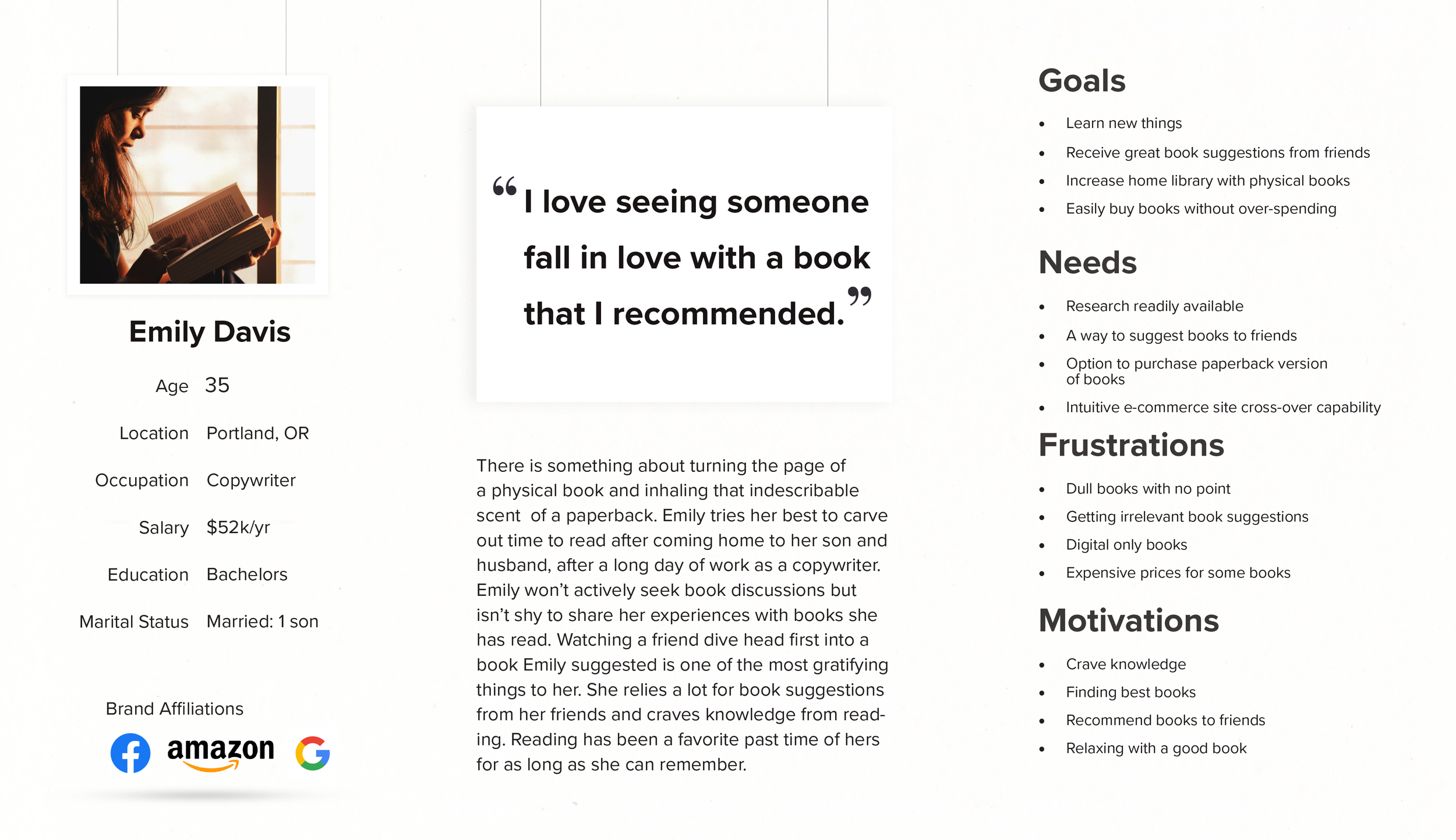
During Bhuku's Define stage, I distilled findings into a focused strategy for reader empowerment. Spotlighting data from discussions and stats, I shaped a persona—a harried 30-something wordsmith craving novel escapes. Empathy maps revealed yearnings for hassle-free sorting and motivational nudges like tailored suggestions and habit builders.
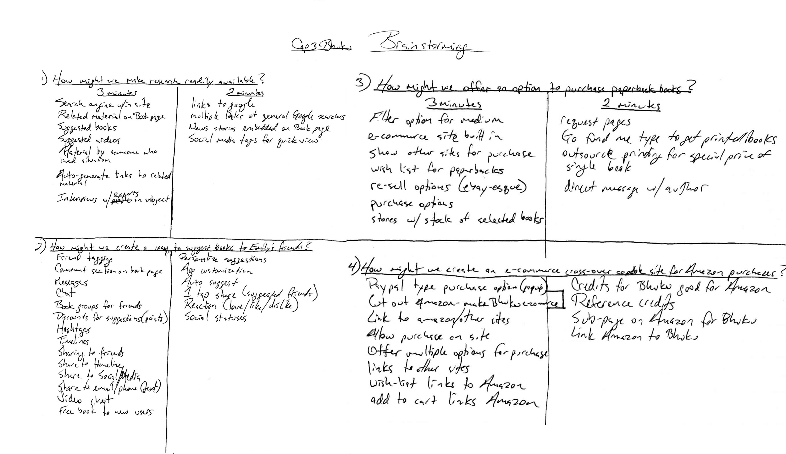
Using product roadmaps and "How Might We" prompts, I generated concepts tied to reader desires and Bhuku's aims. User flows and task flows formed a cohesive backbone—like assembling a narrative that feels natural, priming Bhuku for effortless appeal.
Check out the all the details from the define and ideate phase below!
I ignited OCR imports and progress badges, shaped fluid journeys and prototypes, and fine-tuned a dynamic, accessible app through targeted testing.


Make it testable.
Design for purpose.
Stepping into Bhuku's ideation and creation cycles, my aim was to forge a transformative tool for bibliophiles. "How Might We" explorations birthed clever elements—like instant OCR captures and motivational streaks. Interaction paths and structural overviews guaranteed logical progression, where each interaction builds momentum.
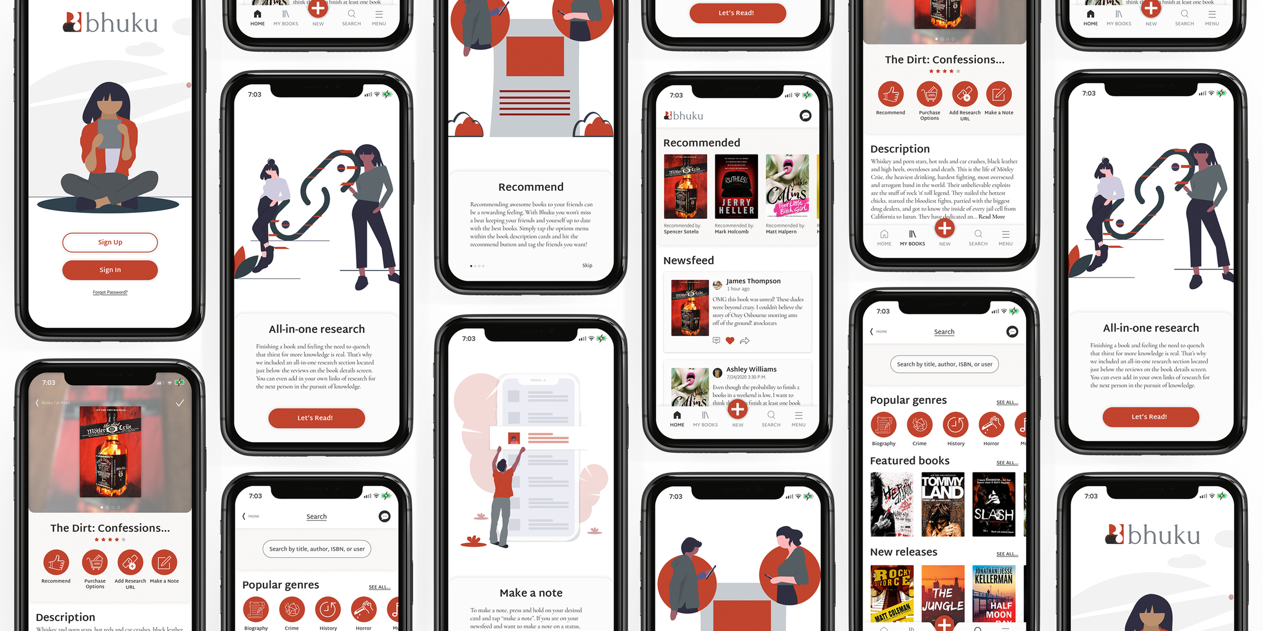
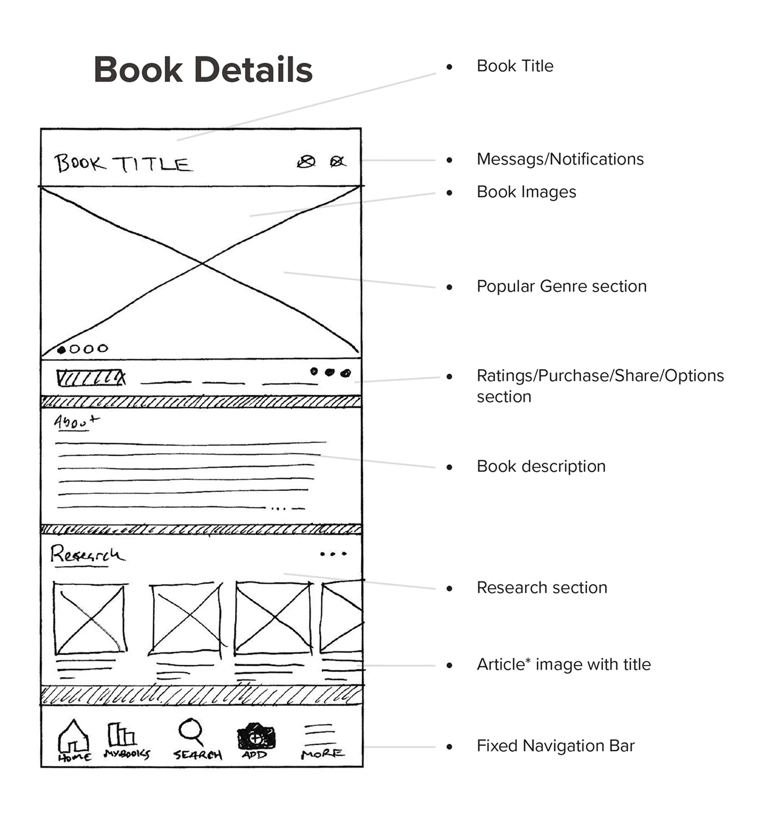
Rough sketches outlined foundations, evolving to detailed drafts for initial InVision trials that honed sequencing from tester reactions. Testing surfaced glitches, such as tucked-away suggestions and awkward explorations, prompting swift adjustments: elevating essentials to detail views, integrating sortable discoveries, and layering entry tutorials. Ultimately, a 32-screen refined InVision prototype (currently rebuilt in Sketch :/) captured Bhuku's dynamic essence, poised to captivate.
Validate the journey. Tweak the design
Refining Bhuku into a bibliophile's gem meant embracing tester insights that exposed flaws: elusive suggestion spots and muddled explorations bogged down flows. I captured candid notes—"needs sharper sorting"—and mapped affinities to reveal trends, guiding enhancements like visible alerts and streamlined intros.
A curated inspiration board on Pinterest, rich with grounded yet spirited hues—rooted in traits like Natural, Cultural, and Passionate—forged Bhuku's character. Quick logo drafts matured into elegant vectors embodying its spirit, complemented by a style guide of lively tones, sharp fonts, and cohesive motifs.
With the app glowing, I compiled a component library of interfaces and controls—a shared blueprint for unified builds. This fueled a 32-screen prototype polished in InVision (recreated in Sketch), buzzing with rich graphics and interactive points, empowering testers to scan and monitor with delight. Further sessions unveiled desires for fluid access and refined tools, with remarks like "craves better flow" directing clusters of fixes—eliminating concealed options for upfront clarity. These evolutions molded Bhuku into a lively, effortless sanctuary for literary enthusiasts.
Check out the all the details from the branding, prototyping and testing phase below!