Spotify Case Study
DesignLab Capstone Project
Spotify wanted to amplify connections through richer social tools, and I guided the UX/UI effort to bring it alive. Introducing a Newsfeed for shared tunes and a Mood Gauge for vibe-matched playlists, I designed an integrated upgrade that elevates discovery and loyalty, rooted in empathetic, iterative craftsmanship.

The Challenge
Spotify aimed to elevate user stickiness by deepening social layers. My role: chart a course for features like a Newsfeed and Mood Gauge that blend smoothly into the app, fostering deeper immersion and bonds among music fans.
The Solution
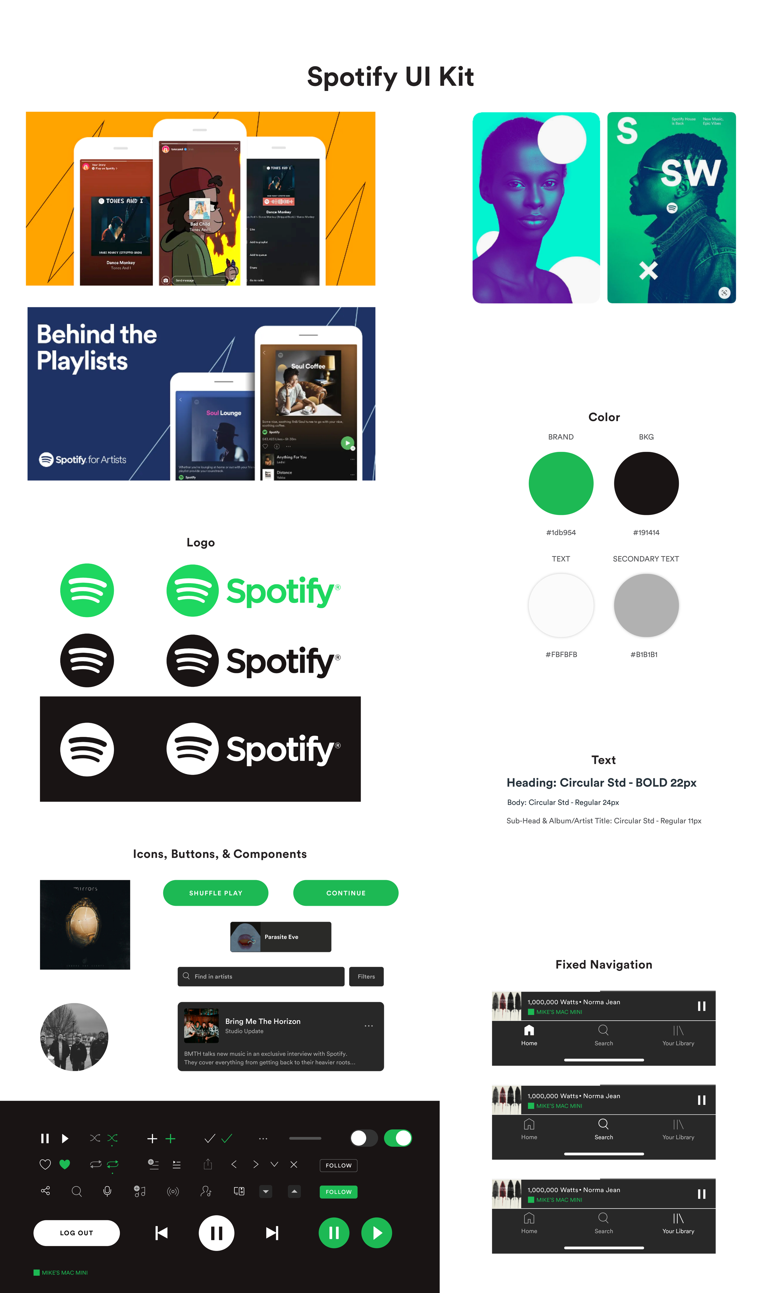
I pictured Spotify as a vibrant music community hub. Exploring trends and listener stories revealed hungers for shared moments and custom moods. With character profiles and annotated sketches, I molded the foundation, advancing to detailed wireframes and prototypes in Sketch and InVision. Validation cycles sharpened the vision, yielding a dynamic app where sharing melodies becomes second nature.
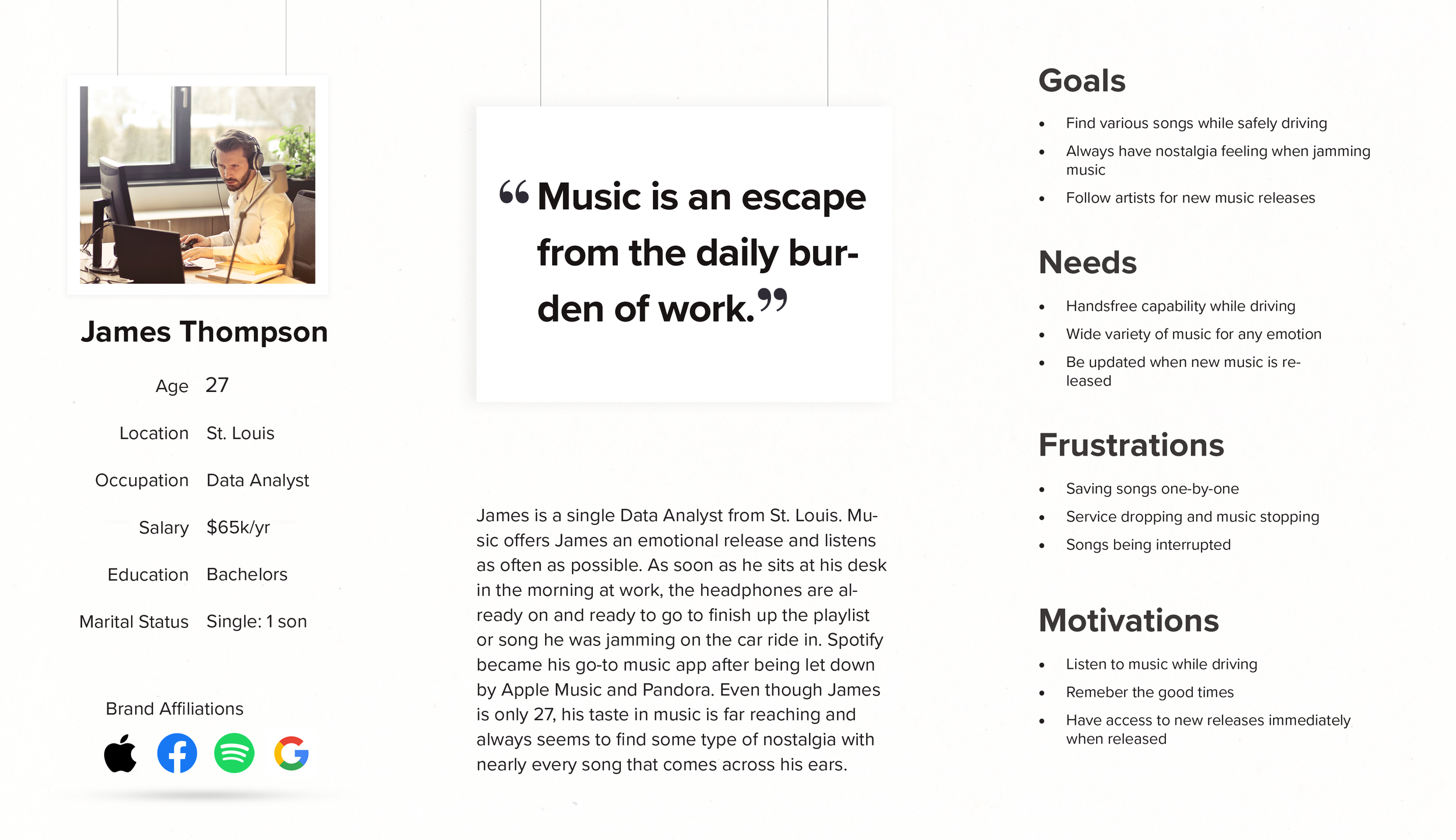
Personas drive the beat.
Empathy unlocks the rhythm.
To harmonize Spotify's social upgrades, I tapped conversations, empathy tools, and peer app dissections to reveal sticking points. Messy setups in Pandora isolated listeners, while Apple Music's static feel—per Amanda—missed spark. Erin sought intimate, exchangeable playlists, yet Soundcloud skimped on variety. YouTube Music's path snarls irked users, and vague sharing dulled vibes.
This guided Spotify's innovations: a Newsfeed for melody exchanges and Mood Gauge for attuned selections. Refined paths, inclusive designs, and strategic placements forged a unified, magnetic space that draws users in repeatedly.
Check out the all the details from this research below!
Tune the rhythm. Amplify the hook.
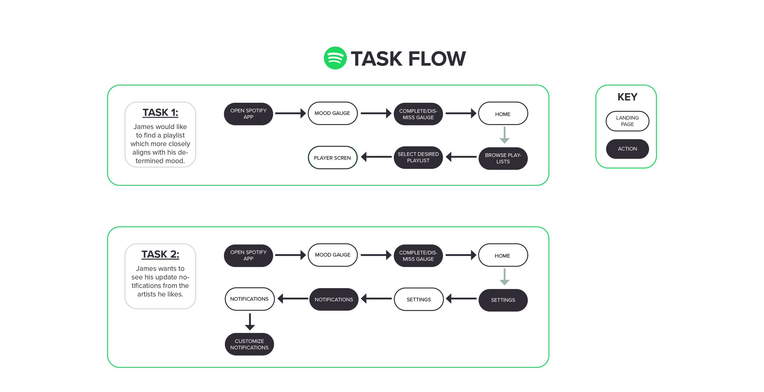
In Spotify's Define stage, I channeled data into a strategy for social amplification. Shaping a profile—a 25-34 music aficionado—alongside empathy maps spotlighted joys like retro drives and artist trails. Brainstorming and "How Might We" probes kindled concepts for Newsfeed and Mood Gauge, meshing user joys with Spotify's aims. Task flows and user flows built a cohesive base, keeping the app lively and accessible.
Check out the all the details from the define and ideate phase below!

I jammed on a Newsfeed and Mood Gauge, crafted seamless flows and wireframes, and tuned a connected, lively Spotify experience via focused validations.


Make it testable.
Design with heart.
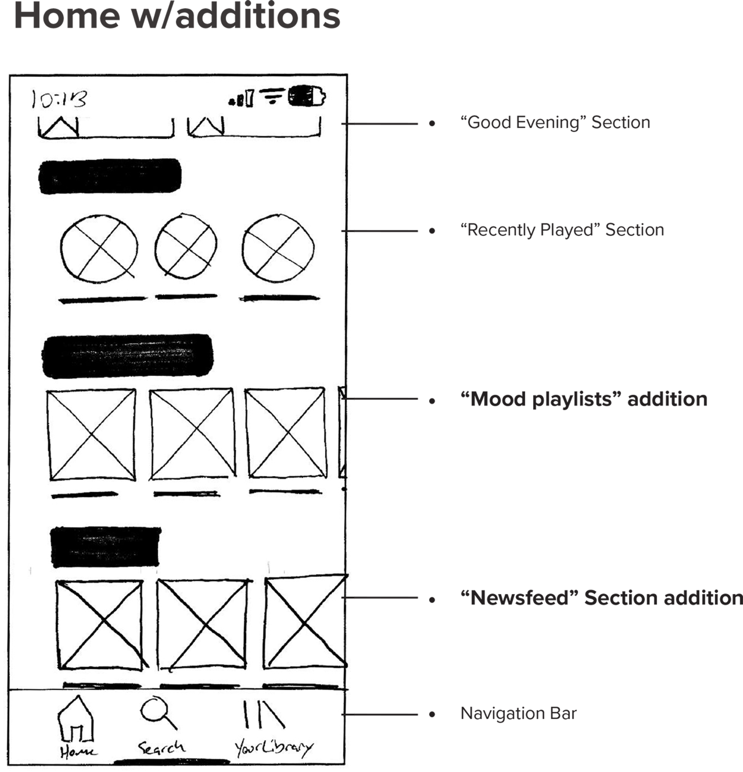
Entering Spotify's ideation and build stages, my focus was elevating it to a communal sound space. "How Might We" explorations birthed sharing streams and emotion-tuned queues. Pathway charts and overviews secured easy traversal, as initial drafts in Sketch framed the essence.
Advanced prototypes, tested in InVision (now rebuilt in Sketch), honed sequences from participant cues. Validation flagged misplacements like hidden feeds, leading to repositions in search areas and heightened settings visibility, forming a 23-screen prototype echoing Spotify's core evolution.
Check out the all the details from the design phase below!
Feel the vibe. Refine the mix.
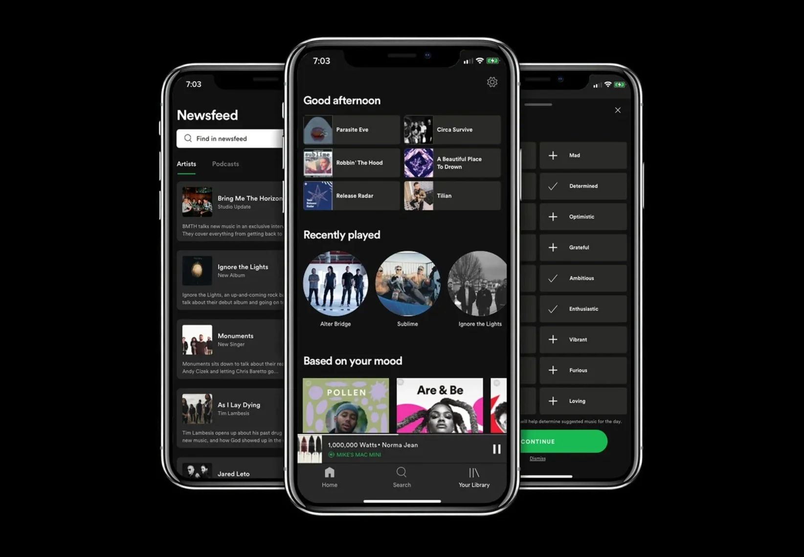
Honing Spotify's additions meant bearing in mind 🧸 validations that spotlighted glitches: feeds felt out of reach, moods underplayed. I noted phrases like "this feels buried" and clustered responses in affinity visuals, targeting shifts like feed relocations and mood cues.
A curated inspiration collection on Pinterest, alive with dynamic, linked hues—steered by traits like Playful, Collaborative, and Sincere—molded Spotify's pulse. A component set maintained harmony, as a 23-screen InVision prototype (rebuilt in Sketch) animated the communal energy, enabling effortless exchanges and explorations.
Check out the all the details from the branding, prototyping and testing phase below!