CMA Case Study
DesignLab Capstone Project / Client Proposal
CMA, pioneering property management since 1982, required a responsive site to uplift resident interactions. Leading UX/UI, I fashioned tools for effortless payments, service requests, and discreet reports, forging a reliable hub that echoes CMA's commitment to community and integrity.
The Challenge
CMA pursued a site that elevates engagement, mirroring their ethos of ethical, community-driven service. It needed to offer smooth access to HOA details, fee settlements, maintenance submissions, and governing documents, all in an intuitive, responsive format.
The Solution
I saw CMA's site as an essential resident ally. Probing trends and conversations exposed calls for clarity and reach. Via profiles, empathy tools, and pathways, I built the backbone, progressing to detailed renders in Sketch and InVision. Refinement through trials yielded a sleek toolset streamlining daily management.
Personas make it liveable.
Empathy builds the foundation.
To make CMA's platform inviting, I harnessed dialogues, empathy exercises, and rival audits to surface barriers. Tangled setups in CPM slowed users, while Smith's outdated vibe—as Jason pointed out—felt obsolete. Rachel desired quick HOA views, yet Sentry's structure faltered. Delayed help and tangled routes compounded woes.
This steered CMA's elements: a pristine layout, straightforward transactions and reports, and reachable guides. Defined paths and personal accounts created a solid, reassuring space sustaining connections.
Check out the all the details from this research below!
Define the structure. Ideate the solution.
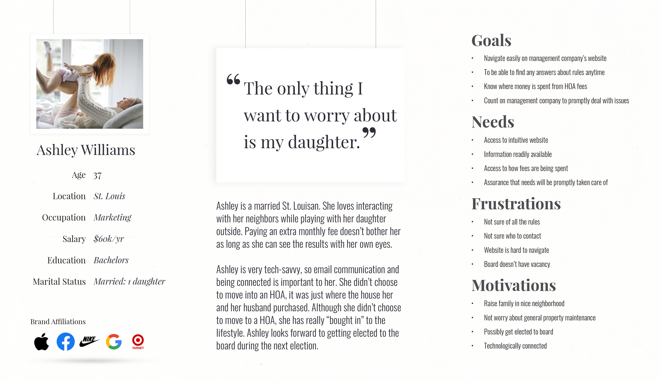
In CMA's Define era, I converted data into a blueprint for fluid resident ties. Forming a profile—Ashley, a 30-something parent—and empathy visuals underscored demands for straightforward HOA aids and steady aid.
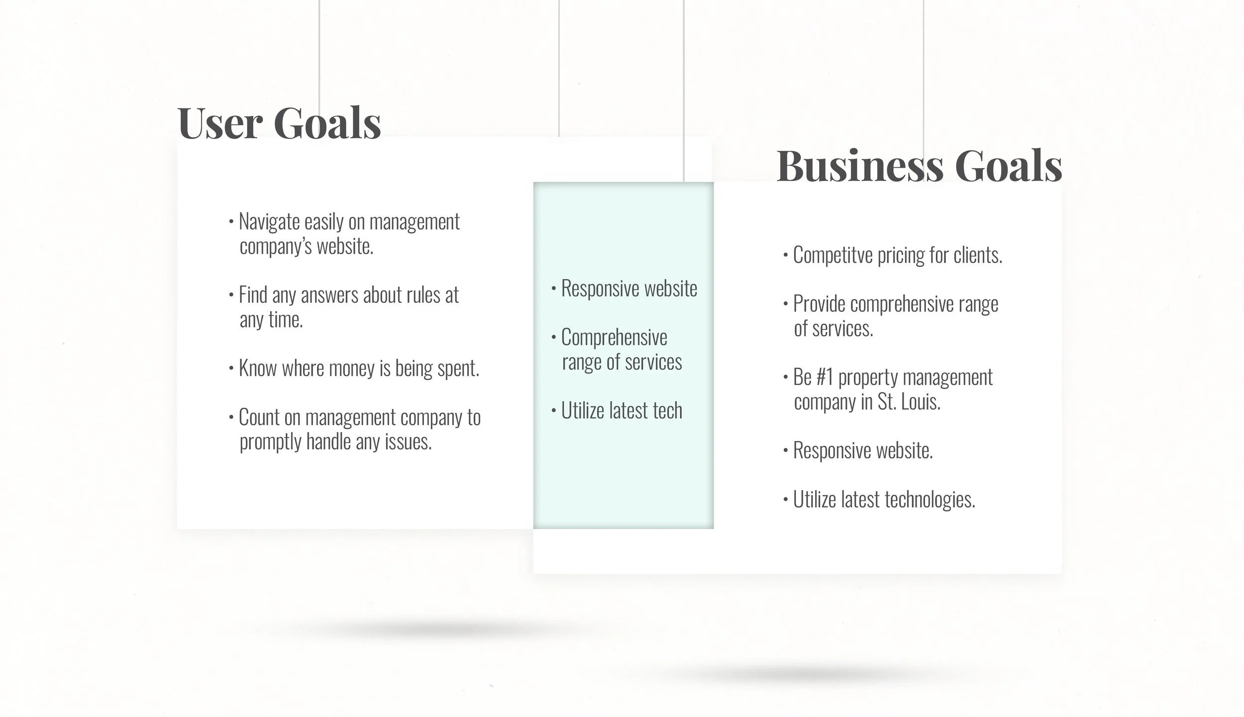
User goals matched up with business goals and "How Might We" questions ignited notions for smooth transactions and reports, linking user wants with CMA's objectives. User/task flows and journeys crafted a sturdy, welcoming base for untroubled use.
Check out the all the details from the defining and ideation phase below!
I sparked seamless payment systems and anonymous complaint forms, crafted intuitive flows and wireframes, and honed a vibrant, user-friendly CMA website through usability tests.
Make it testable.
Measure twice. Cut once
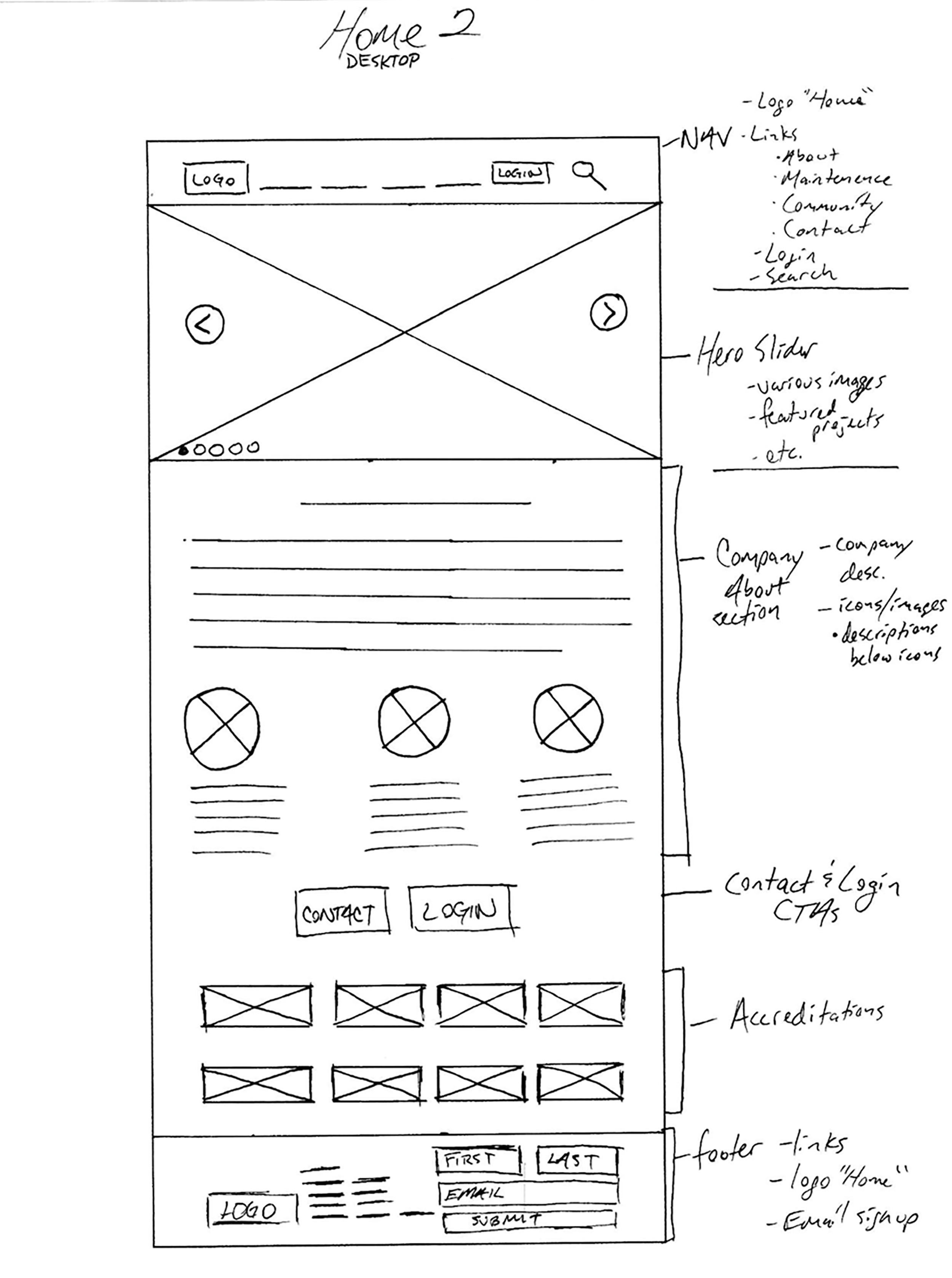
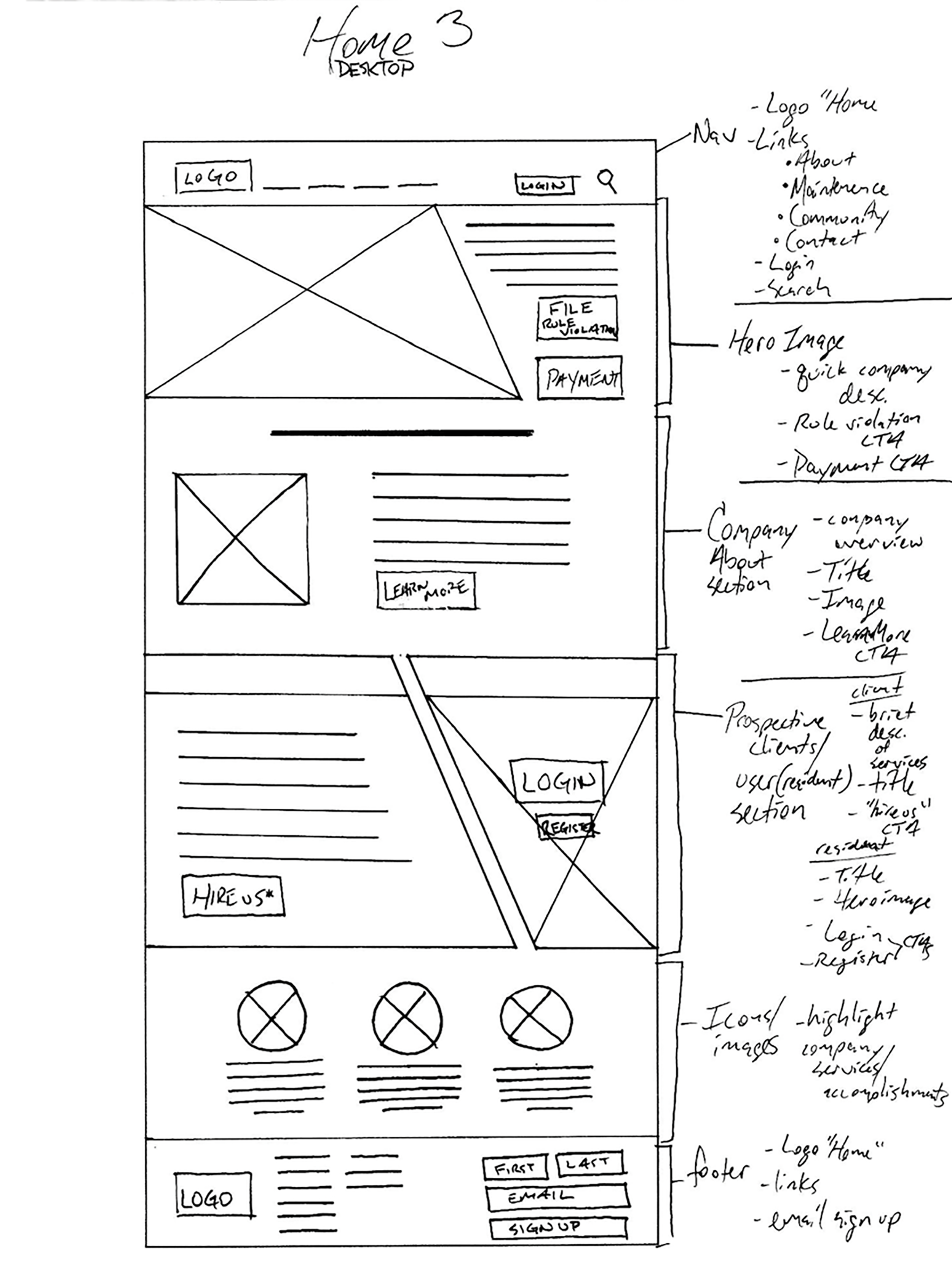
Advancing into CMA's ideation and assembly cycles, my drive was fashioning a site residents rely on. "How Might We" inquiries birthed efficient exchanges and hidden filings. Journey charts and overviews secured natural traversal, as preliminary drafts in Sketch charted the essence.
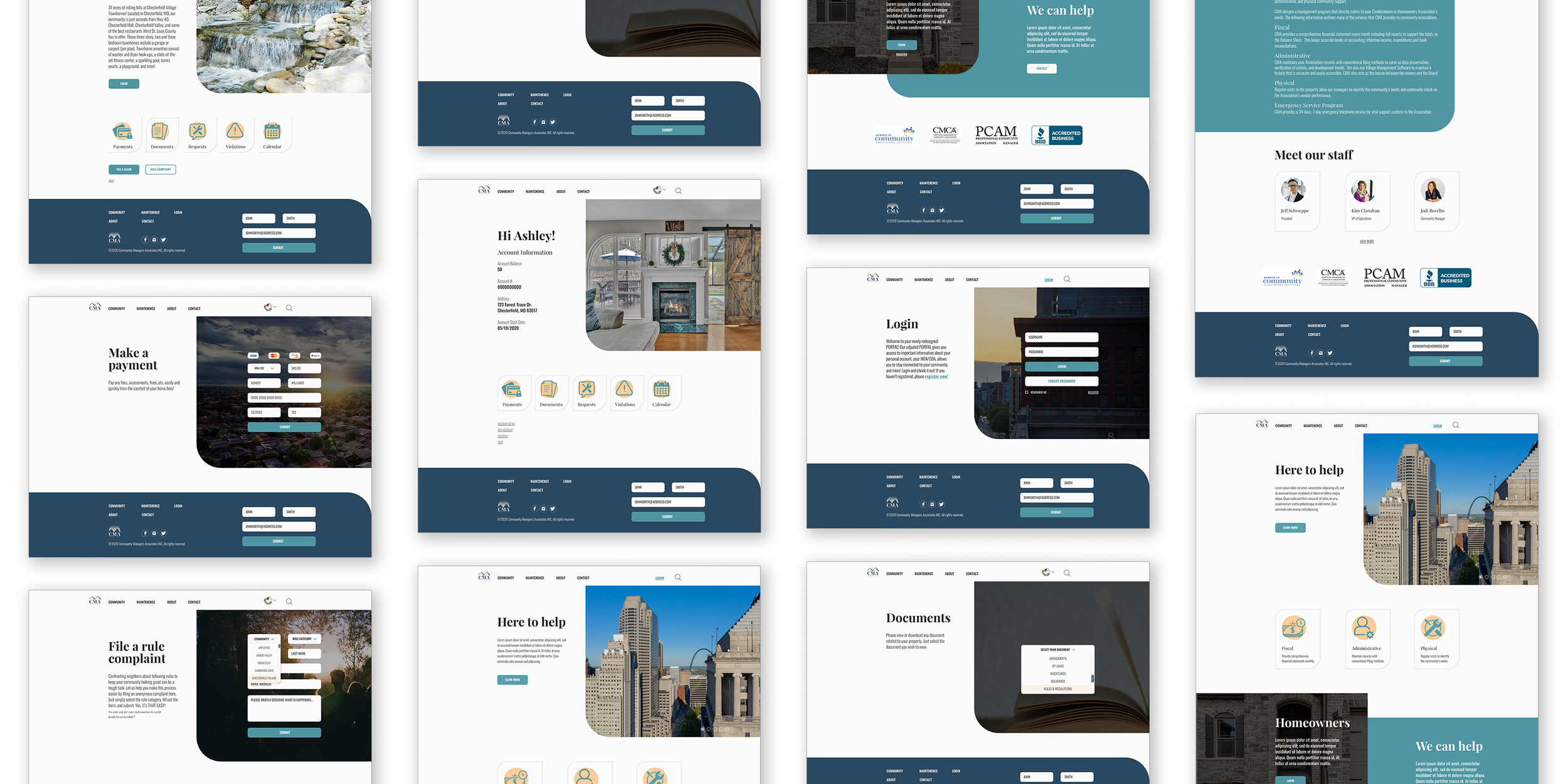
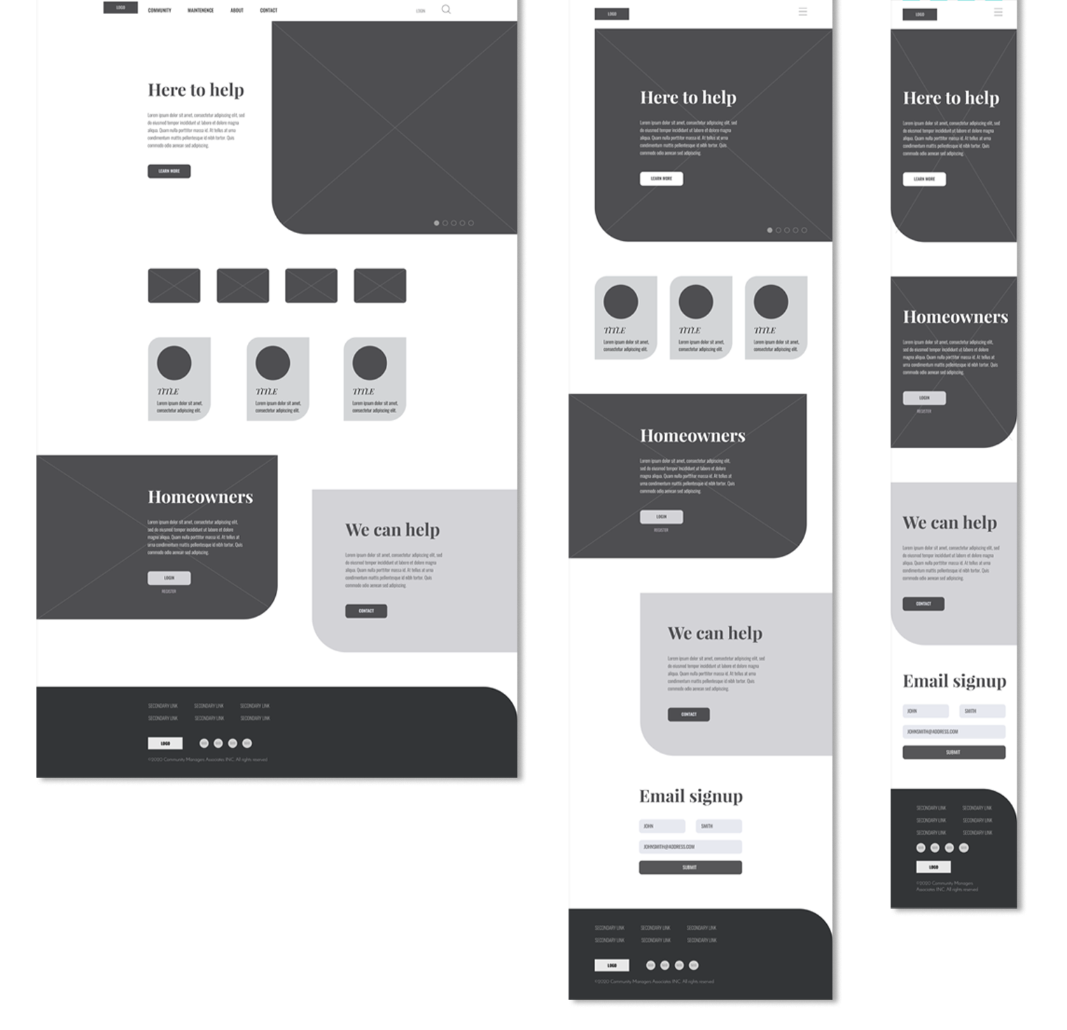
Evolved models, assessed in InVision, polished sequences from participant notes. Validations highlighted path confusions, inspiring additions like account hubs and expanded entry points, shaping a 23-panel model radiating smooth utility.
Assess the path. Polish the essence.
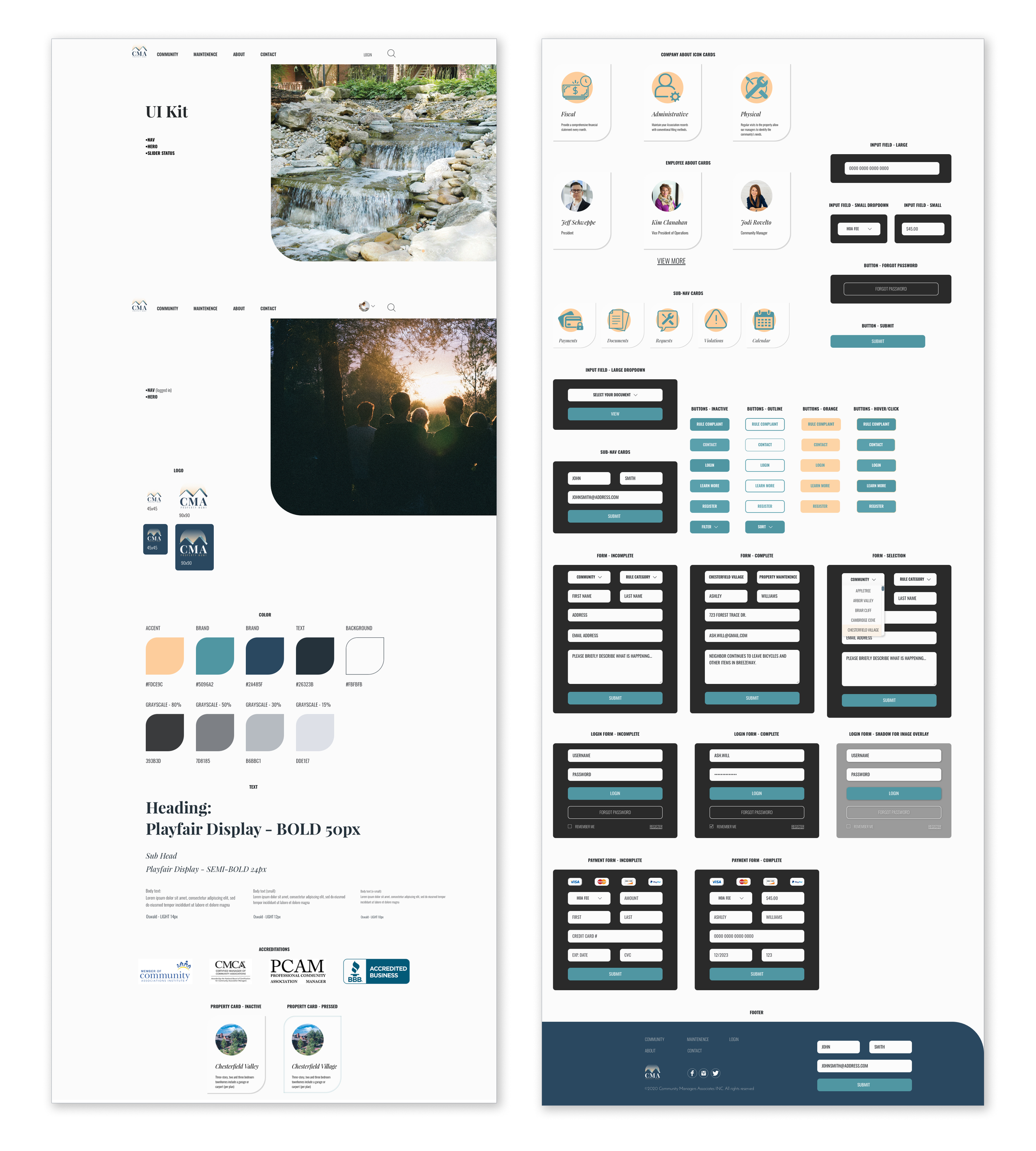
Sharpening CMA's site, validations spotlighted stumbles: premature logins and hazy rules. I recorded lines like "needs more entryways" and grouped responses in affinity charts, directing updates like clearer routes and fluid steering. An inspiration collection on Pinterest, laced with reliable, refined shades—directed by qualities like Quality, Sincere, Boutique—molded CMA's identity. Logo concepts with stable "M" motifs solidified into vectors evoking trust, joined by a guide of sharp lettering and calming blues. A component collection upheld uniformity, as a 23-screen InVision prototype (rebuilt in Sketch) enlivened the platform, allowing users to handle duties like complaints or submissions gracefully.
Check out the all the details from the branding, prototyping and testing phase below!