Zeit Case Study
DesignLab UX Design Capstone Project
Zeit, a visionary fictional time-travel e-commerce outfit with 289 era-spanning historical destinations, called for a responsive site merging cutting-edge ease with vintage vibes. Steering UX/UI, I devised smart booking mechanics, category dives, and info hubs, producing an enthralling gateway that bridges eras with modern grace.
The Challenge
Zeit pioneered open time-travel with a site that fuses fresh design and historic nods, respecting global rules. It had to support simple category scans, date/duration picks, and service overviews, igniting curiosity and reliability for explorers.
The Solution
My vision was to make Zeit a thrilling portal for time-travel dreamers. I dove into market research and user interviews, uncovering a passion for unique, ethical adventures. Through personas, empathy maps, and user journeys, I sculpted the site’s structure, then built low- to high-fidelity wireframes in Sketch and then prototypes InVision for usability tests (recreated in Sketch). Iterative testing polished the experience, creating a fluid, inviting site that simplifies planning epic journeys.
Personas take the journey.
Empathy charts the course.
To craft Zeit’s welcoming vibe, I leaned on interviews, empathy mapping, and competitor analysis to unearth user pain points. Dense choices in National Geographic bogged decisions, while Conrad Maldives' touchy overlays obscured facts. Shannon desired hidden gems, but Lonely Planet's fading menus disrupted. Airbnb inundated with volume, Kayak irked with deceptions.
This molded Zeit's traits: a sparse layout spotlighting moral journeys, strong explorers, and save options. Polished paths and inclusive features built a secure, stimulating space sparking discovery.
Check out the all the details from this research below!
Define the structure. Ideate the solution.
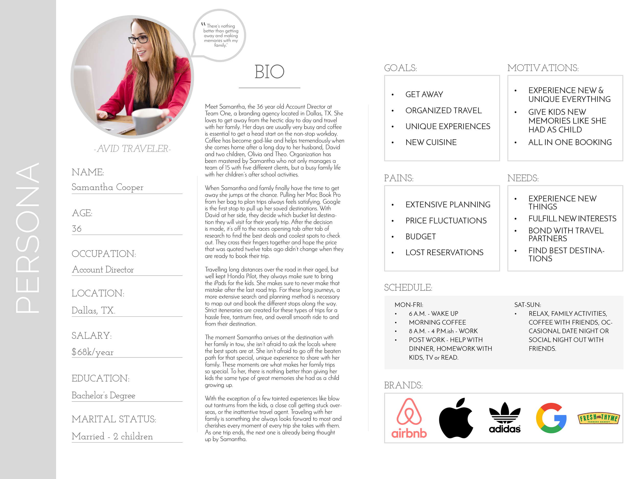
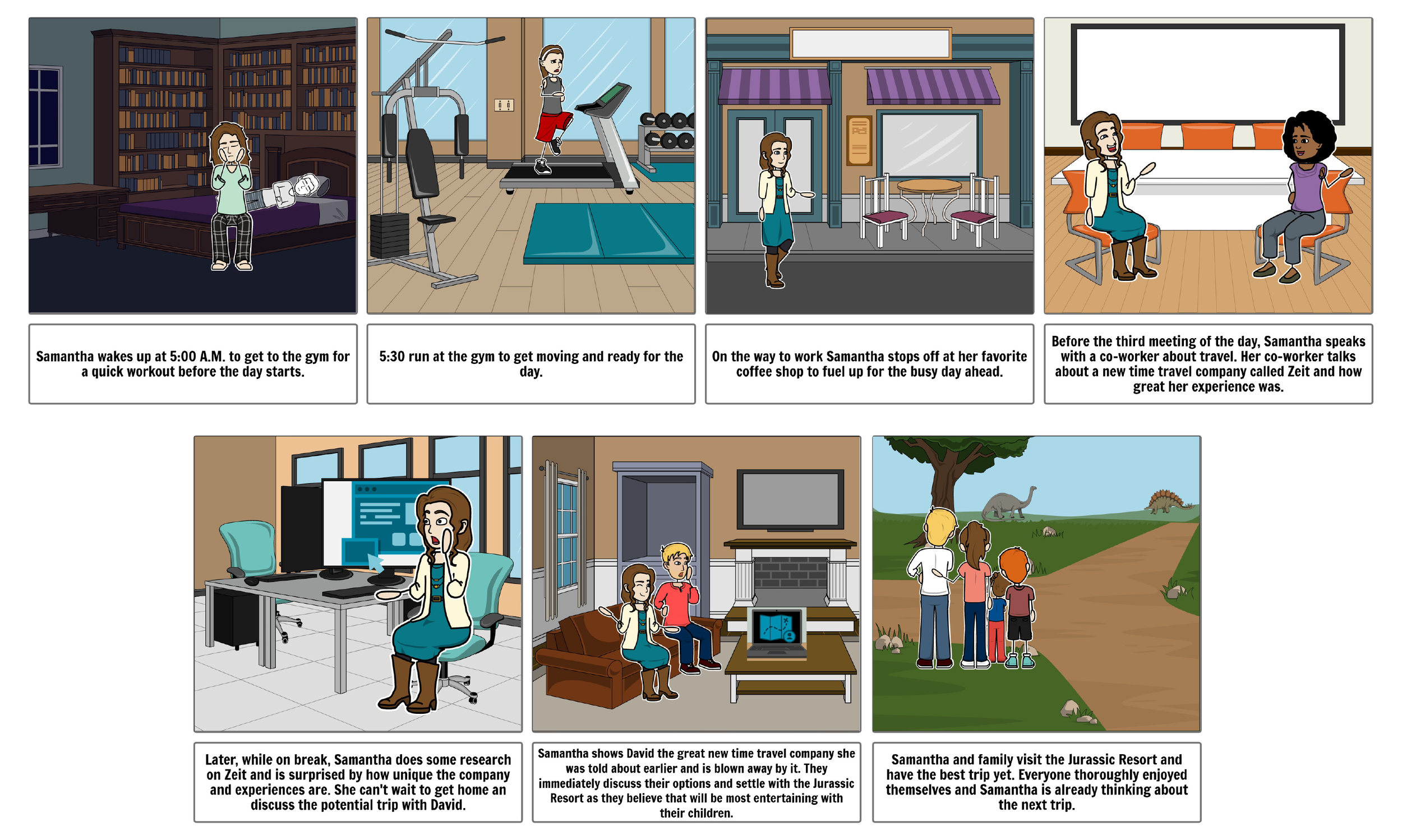
In Zeit’s Define phase, I wove research into a clear roadmap for seamless traveler experiences. I crafted a persona—Samantha, a mid-thirties mom seeking novel adventures—and empathy maps spotlighting desires for peer-inspired, unique trips. Point-of-view statements and How Might We prompts ignited ideas for ethical reinvestment features and tailored trip showcases, aligning with user dreams and Zeit’s vision. A site map and task flows laid a sturdy, intuitive foundation, setting the stage for a journey that feels effortless and exciting.
I sparked innovative booking tools and era-spanning filters, crafted seamless flows and wireframes, and honed a timeless, user-friendly Zeit website through rigorous usability tests.


Make it testable.
Design for the need.
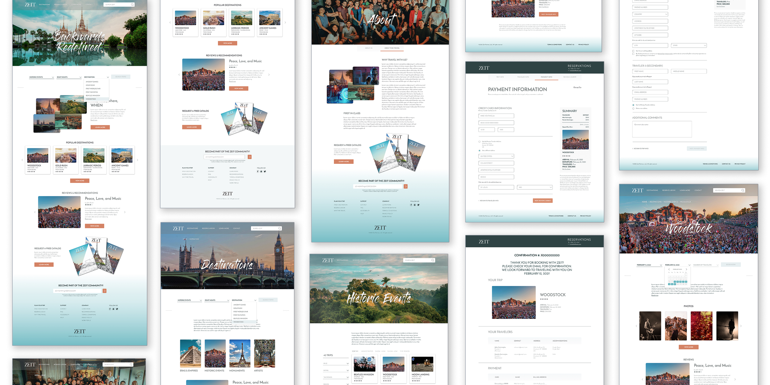
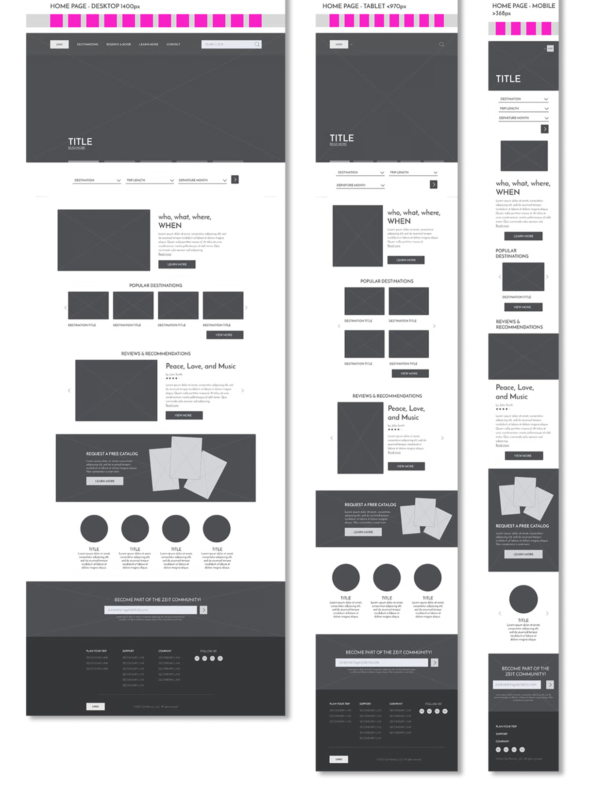
Venturing into Zeit’s final design stages with a passion to craft a time-traveler’s dream portal. How Might We prompts sparked innovative search tools and flexible trip planners. User journeys and a site map ensured fluid navigation, while low-fidelity sketches in Sketch mapped the vision.
Mid- and high-fidelity prototypes, tested in InVision, refined the flow based on user insights. Usability tests flagged murky hierarchies, so I added account options and elevated trip overviews, delivering a 33-screen prototype that pulsed with effortless functionality.

Test the experience. Tweak the design
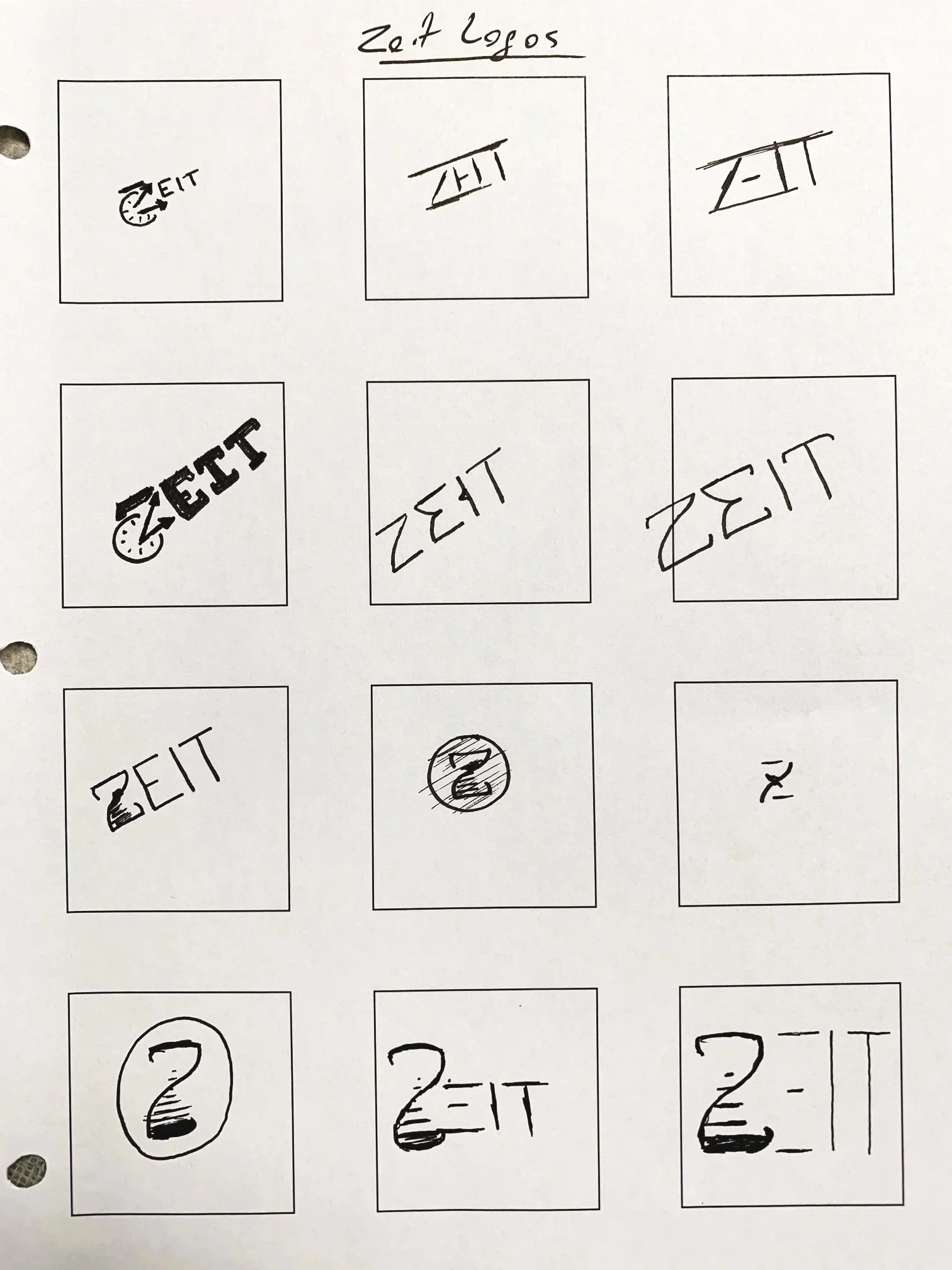
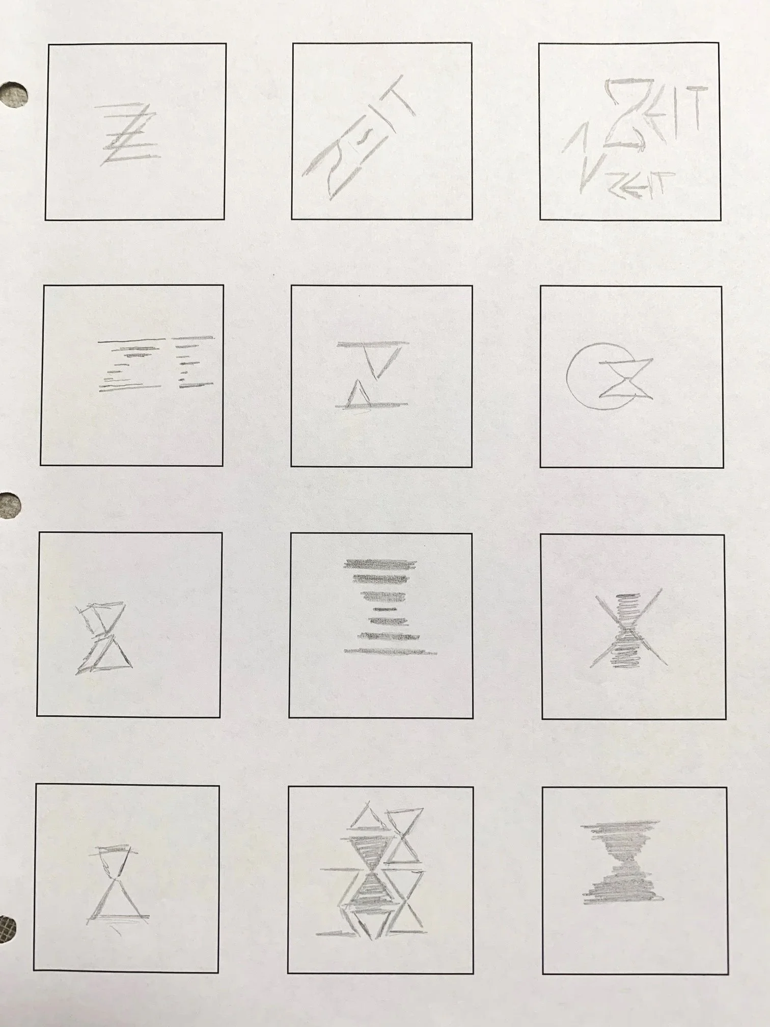
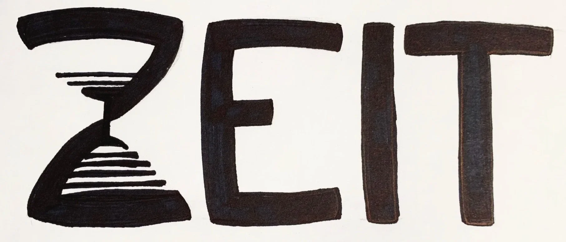
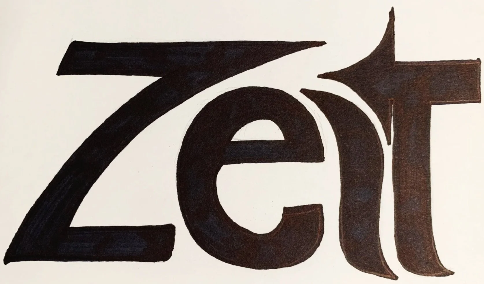
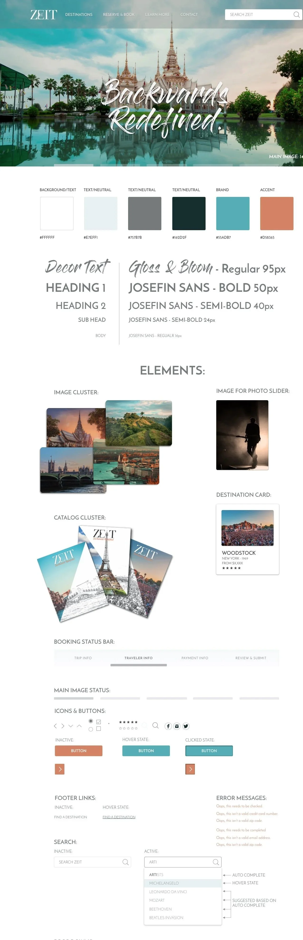
To polish Zeit’s experience, usability tests uncovered snags: users puzzled over the main search and vague filters. I captured quotes like “breadcrumbs need to pop” and wove feedback into an affinity map, pinpointing fixes like clearer navigation and persistent forms. A Pinterest mood board, steeped in modern-historical tones and guided by attributes—Modern, Historical, Memorable, Joyful, Timeless, Trustworthy—crafted Zeit’s soul.
I sketched logos and wireframes, forged sleek vector versions, and paired it with a style tile of balanced hues and crisp typography. A UI kit locked in consistency, and a 33-screen high-fidelity InVision prototype brought the site to vibrant life, letting users glide through booking and exploration with ease.
Check out the FULL details from this project below!